Showing posts sorted by relevance for query fourier. Sort by date Show all posts

Sunday, January 24, 2021

Feature Engineering Time Series


"The loss of information that I mentioned above could actually be a useful feature of the Fourier Transformation. Let me explain. Your timeseries probably has some noise in it. One very useful thing that you can do in your feature engineering process would be to take the Fourier Transformation of your time-series. It will probably look pretty chaotic when you do that, because there is some noise built into the signal. So now that you are in the frequency-domain, you can just threshold your transformed data-set. You can do this by simply setting an arbitrary threshold say any frequency with an amplitude greater than 10, any amplitude less than 10, you set to zero. And then you can transform the series back to the time-domain. What you will find when you do this is that your time-series has been simplified. There is less noise. Essentially, what you have done is you have applied a filter to your data. You have filtered out the components of the signal that are likely noise." - Ryan Barnes

Some Fourier transform examples

With code stolen from here [SO] we can see an example:

"A property of the Fourier Transform which is used, for example, for the removal of additive noise, is its distributivity over addition." [1]

When you look at the code to generate this, you'll see it mention it will try to "remove DC". In this context, DC means the average (that is, frequency 0) values. This is a historical legacy of electrical engineering where DC means the Direct Current rather than the waves that make AC electricity.

Now, let's try a 2D representation where I'm actually trying to simulate human behaviour. Let's say it's people going to Church or Synagogue one day per week. We can do this "because the Fourier Transform is separable ... Using these two formulas, the spatial domain image is first transformed into an intermediate image using N one-dimensional Fourier Transforms. This intermediate image is then transformed into the final image, again using N one-dimensional Fourier Transforms." [1]

Can Fourier transforms pick it out of the data? (Code is on my GitHub repository):
Fig 2: Regular activity. Time is the y-axis in the top graphic. The second is frequency space. The third, amplitudes per column.

The first thing to notice is that instead of our spectrum having a peak both side of the origin for the frequency, there are many peaks at multiples of the frequency. These are the harmonics. The reason Figure 1 does not have them is that the signal is made of two pure sinusoidal waves. There are no other frequencies at play.

Now, let's add some noise.
Regular activity with noise
Our regular periodicity is still the most prominent signal in frequency space and the lowest harmonic does indeed correspond to to a regular event - in this case, it's something that happens every 8 days and the lowest harmonic is indeed at 0.125.

Worked example

So much for the theory, let's examine the practise. I note that my /var/log/syslog has lots of noise in it. I want to de-noise it to see if there is something suspicious in it. I used this code in my GitHub repository to spot irregular activity. Note, this is a very simple implementation that just looks at the process that logged an event and its time. I'll make it more sophisticated later.

Anyway, running the parsed log through a Fourier transform resulted in this:

A Fourier transform of syslog events

We can see that there are clearly some regulars so taking them out, we see that the three (arbitrary number alert) most irregular events came from anacron, systemd and nvidia-persistenced. Looking at these logs in syslog did indeed indicated that they were isolated events albeit nothing to worry about (dockerd and containerd were the most regular naggers).


Saturday, March 18, 2023

Comparing Time Series

The domain

Given a time series of various metrics for various hospitals in a region, I want to find if there is any correlation between them. Specifically, I am interested in any metric for one hospital where another lags behind it by a day or so.

Initially, my results were great. In fact, they were too good to be true. See, the problem is that hospital metrics all dance to the same tune of time. When you take away the noise, there is a regular weekly rhythm to the stats.

Consequently, it was not a case of one metric predicting another. It was more that both were conforming to a weekly pattern. This was true even when we considered lags between the two series.

For instance, there may be systemic bias at play. In this case, inpatients are often eagerly discharged in time for the weekend when there are fewer staff on duty. This is true for all hospitals nationally so we should not assume somehow one hospital has some unspecified influence on another if we see them both behaving in the same manner.

In the case of a lag, Mondays see a sharp rise in patients so we should not take too seriously an (anti) correlation with the previous Friday at another hospital.

The importance of being startionary

The problem we had was that our time series was not startionary. "Making a distribution stationary is a strict requirement in time series forecasting... If a distribution is not stationary, then it becomes tough to model." [BexT, TowardsDataScience]

But what does it mean to be stationary?

Terminology

"A stationary time series is one whose properties do not depend on the time at which the series is observed. Thus, time series with trends, or with seasonality, are not stationary — the trend and seasonality will affect the value of the time series at different times. On the other hand, a white noise series is stationary — it does not matter when you observe it, it should look much the same at any point in time." [Forecasting: Princples and Practice a free, online book]

Note that just because a time series looks highly cyclical to the eye, it doesn't mean it is. If you can't predict where it will be in 10 years, it is stationary.

Example of highly cyclical, non-stationary data: annual sales that are heavily influenced by Christmas.

Example of highly cyclical, stationary data: the population of foxes and rabbits. Although cyclical, the exact length of a cycle is not known.

"The [200 day] Google stock price was non-stationary ... but the daily changes were stationary ... This shows one way to make a non-stationary time series stationary — compute the differences between consecutive observations. This is known as differencing.

"Transformations such as logarithms can help to stabilise the variance of a time series. Differencing can help stabilise the mean of a time series by removing changes in the level of a time series, and therefore eliminating (or reducing) trend and seasonality." [ibid]

The Tools

How do we know that our series is stationary? Jason Brownlee [TowardsDataScience] suggests three approaches: look at plots, use statistical tests or compare summaries for partitions of the data. I'll look at the first two.

When we plot our data, it certainly doesn't look like it is stationary at first blush as there seem regular troughs and peaks:
A&E admissions at two hospitals

If we zoom in, we can see there is a definite weekly cycle:
Zoomed in, plus the 1st order derivatives

One trick to make the series stationary is to use the first order derivatives of the data instead of the actual data itself. However, this too seems to be non-stationary (see pic above).

To check more rigorously if the series is stationary, we can use the Augmented Dickey-Fuller test in StatsModels. Here, the null hypothesis is the distribution is non-stationary, time-dependent. The p-value of us rejecting the null hypothesis was about 0.02 for the raw data and 7x10⁻⁹  and 8x10-21 for the first and second derivatives respectively. 

But the data and its derivatives still look stationary to me (why these ADF tests reported such low p-values is still a mystery to me). Some Fourier analysis seems to suggest that the data is indeed time-dependent:
Fourier analysis of the admissions data

Look at those peaks at about 0.14 (= 1/7) on the x-axis that indicate a weekly trend.

Another way to make the data stationary is to center the data. We know how to do this with hospitals as admissions are strongly correlated with days of the week. After doing this, the Fourier analysis looks like:
Fourier analysis on the same admissions centered of their mean by day-of-week

Much better! The largest Augmented Dickey-Fuller values is 2x10⁻⁷ and the timeseries of centered data also looks more likely to be stationary:
The centered admissions data for two nearby hospitals

Now, we can run a Granger Causality test. Here "we reject the null hypothesis that x2 does not Granger cause x1 if the p-values are below a desired size of the test." [StatsModels docs].

Conclusion

Granger Causality comes with caveats, one of which is that your data is stationary. A reason why this is the case is that making your data stationary avoids confounding factors that cause spurious relationships [Wikipedia].

To make your time series stationary may require some domain knowledge.

Wednesday, December 21, 2022

Time series

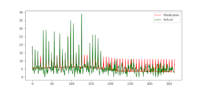
Meta's much hyped Prophet seems to have problems identifying spikes in small numbers. For instance, we had a hospital that was admitting 4- to 5-times the normal number of patients on Fridays. Then, one day for whatever reason, Friday became a day like any other. Despite a lot of brute-force hyperparameter tuning, the ratio of RMSE/mean stayed at about 0.69.

Prophet (mis)handling significant behavioural change

From the issues on Github, "by default the model will do a bad job on this time series because the model assumes smooth seasonality. That assumption comes because seasonality is modeled with a truncated Fourier series, which basically means it cannot change very rapidly."

You can add_regressors to the model but firstly I don't want to manually do this (I'd have to inspect thousands of data sets by-eye!) and when I tried it, my RMSE was worse - for reasons as yet unknown. Plots showed that it simply translated predictions for that spline down the y-axis; there was not change in how it treated the periodicity.

SARIMAX

On the same data, the default SARIMAX implementation in StatsModel gives you:

SARIMAX with default values

You need to explicitly tell it that there is weekly seasonality. In this  case seasonal_order = (1, 0, 1, 7) works well. Note that 7 means we expect weekly behaviour. Indeed, SARIMAX quickly recognises the change:

SARIMAX with an explicitly provided seasonality
And the overall RMSE/mean ratio becomes a little better at 0.61.

Correlations

Don't be fooled by in-series correlations versus cross-series correlations. This SO link shows how the random walk generated by the tossing of two coins can appear to be correlated (just by luck) when of course they could not possibly be. This is because each have in-series correlation; each value in the cumulative total of HEADS-TAILS will be +/-1 the previous.

SciPy appears to have a tool to find the correlation between series even if the effect is lagged.